The 1940s
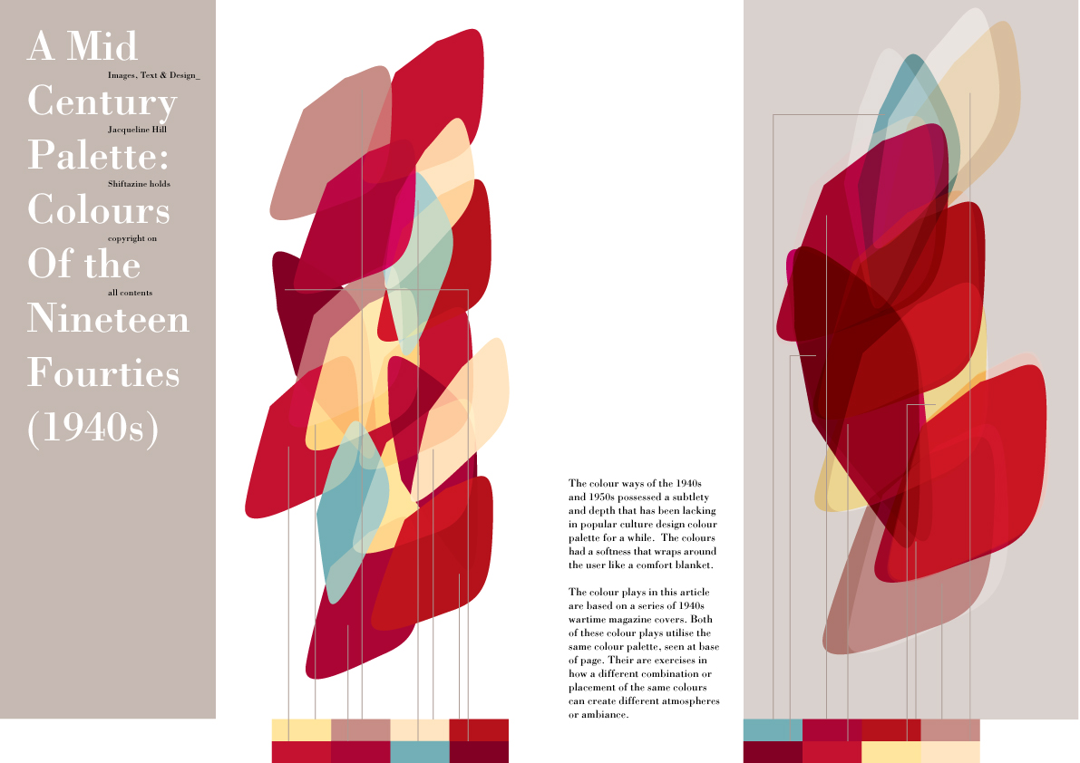
The colour ways of the 1940s and the 1950s possessed a subtlety and depth that has been lacking in the popular culture design colour palette for a while. The colours have a softness that wrap around the user like a comfort blanket.
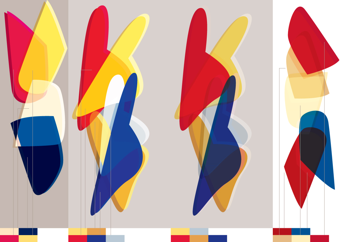
The colour plays in this article are based on a series of 1940s wartime magazine covers. The first spread utilise the same palette, seen at the base of the spread. They are exercises in engaging a different combination, proportions or placement of the same colours to create different atmospheres or ambiance.
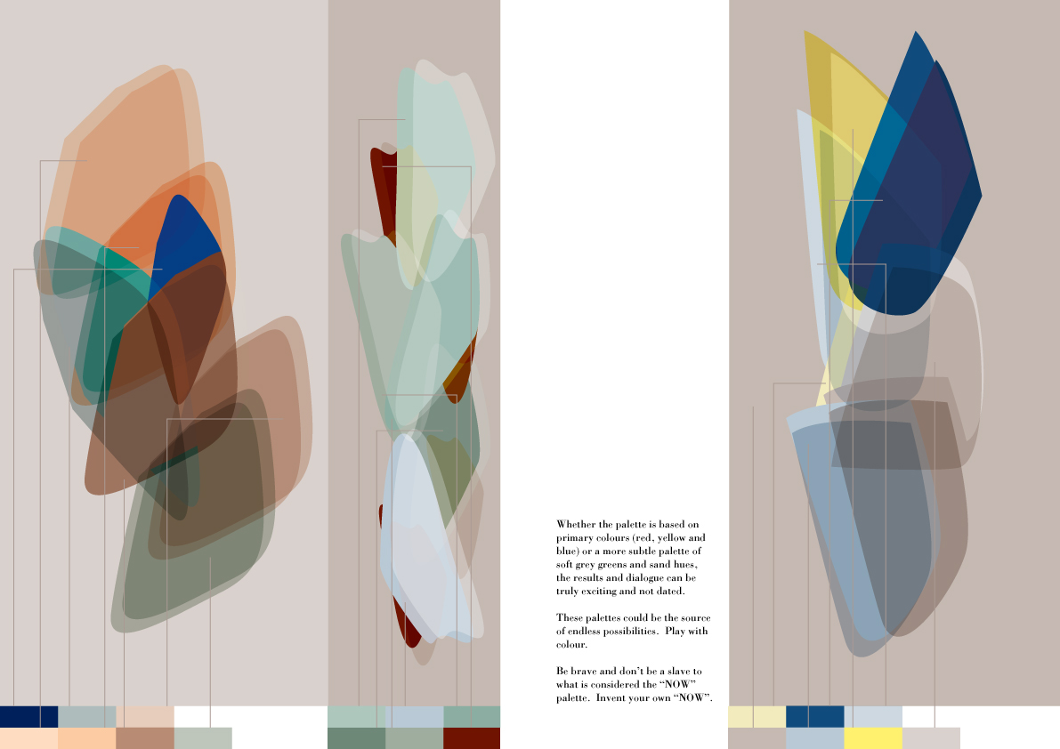
Whether the palette is based on primary colours (red, yellow and blue) as in the second spread or a more subtle palette of soft grey greens and sand hues of the third spread, the results and dialogues can be truly exciting and never dated.
These palettes could be an endless source of possibilities. Play with colour. Be brave and don’t be a slave to what is considered the ‘NOW’ palette. Invent your own.
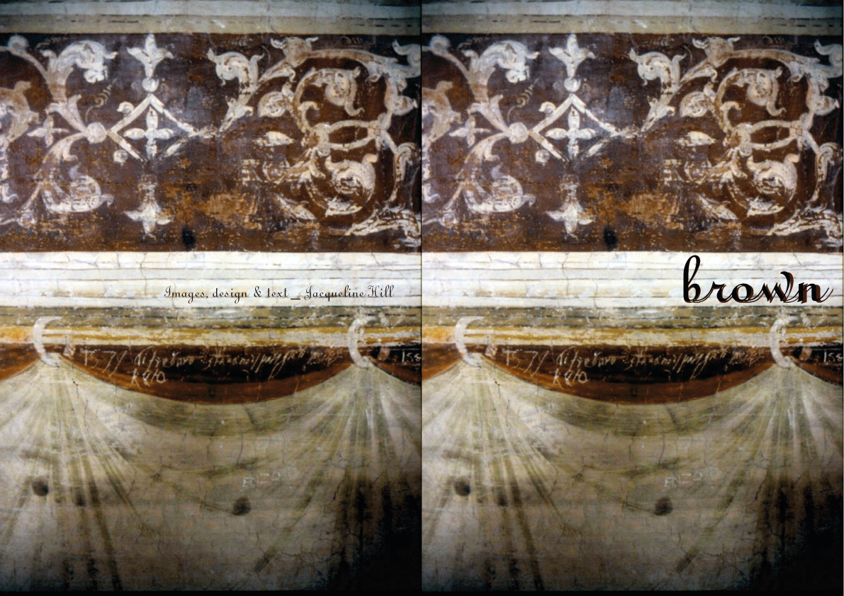
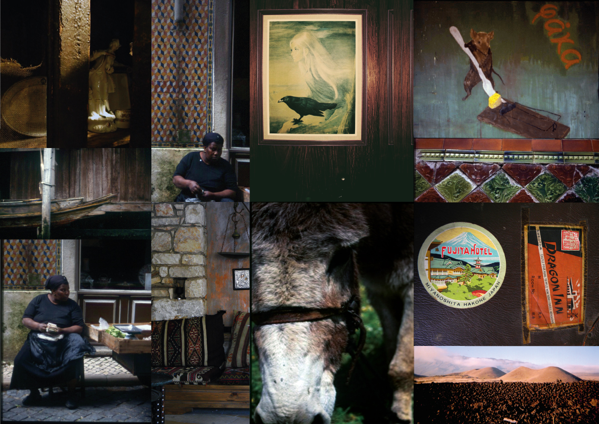
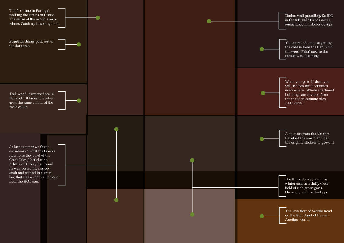
Brown
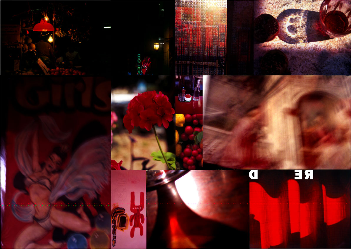
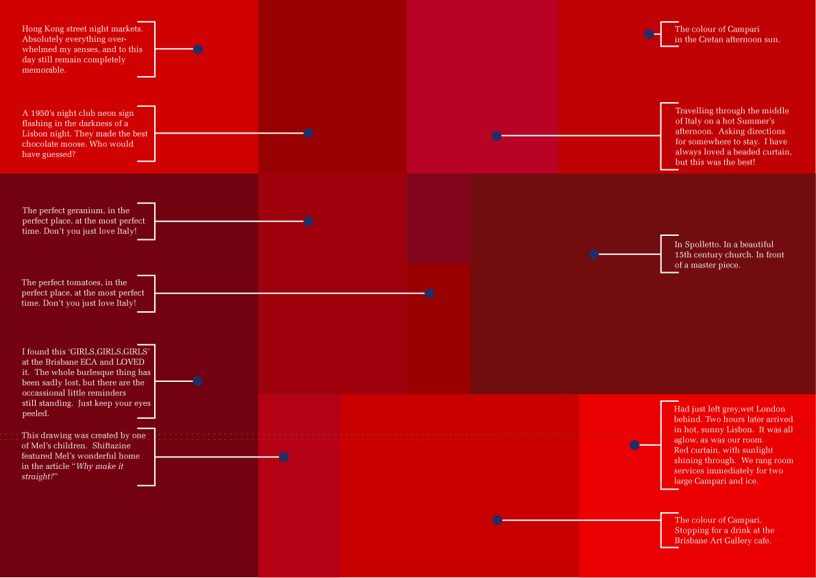
Red
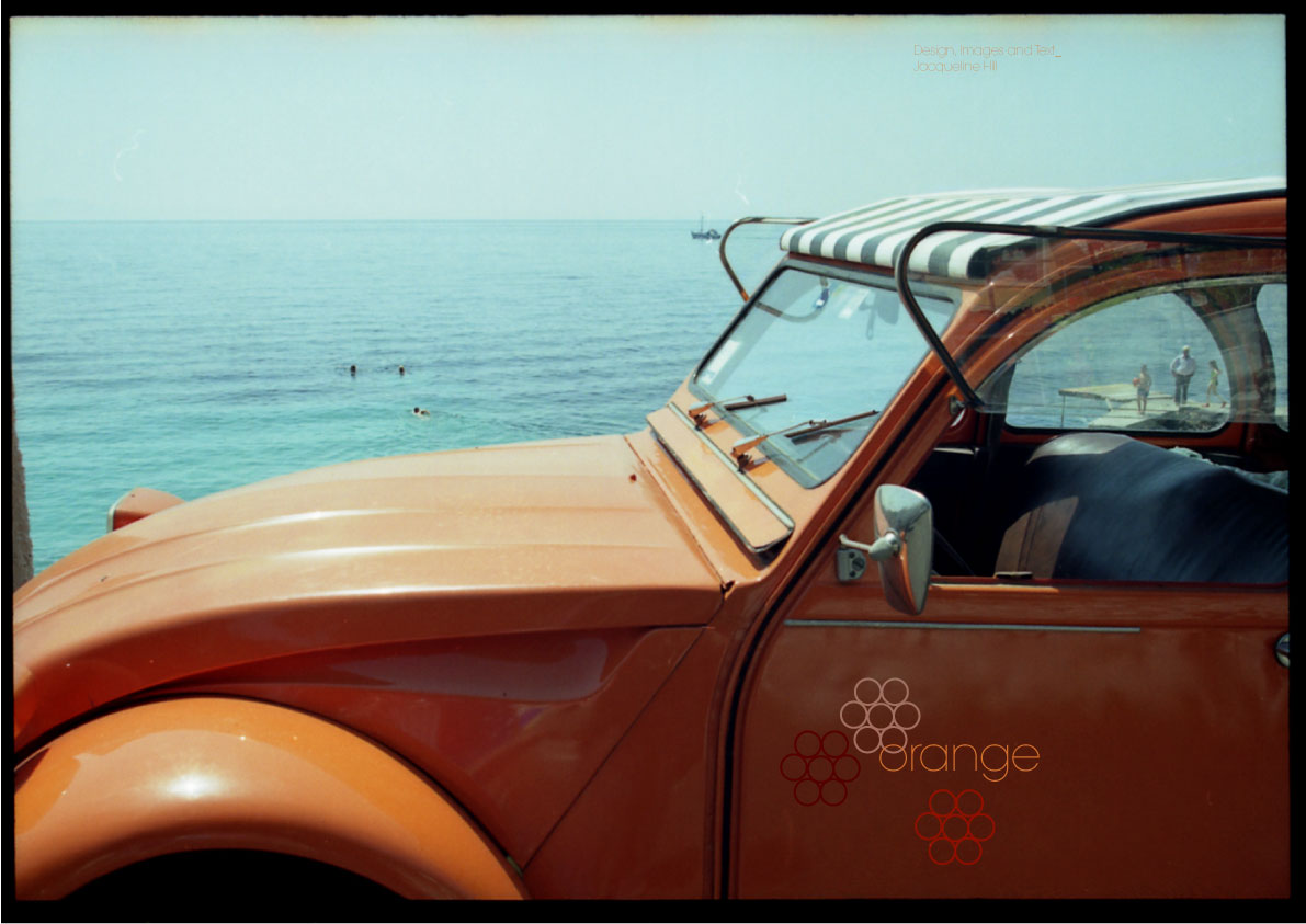
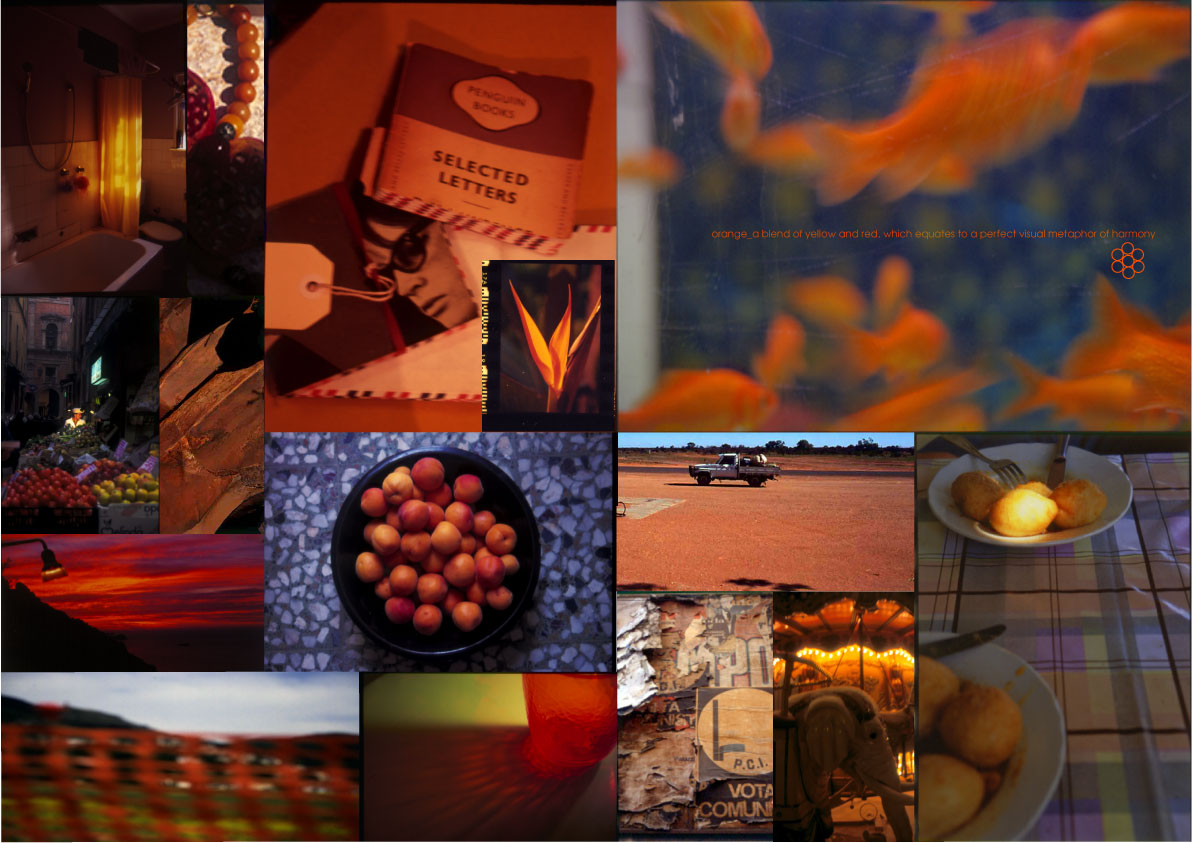
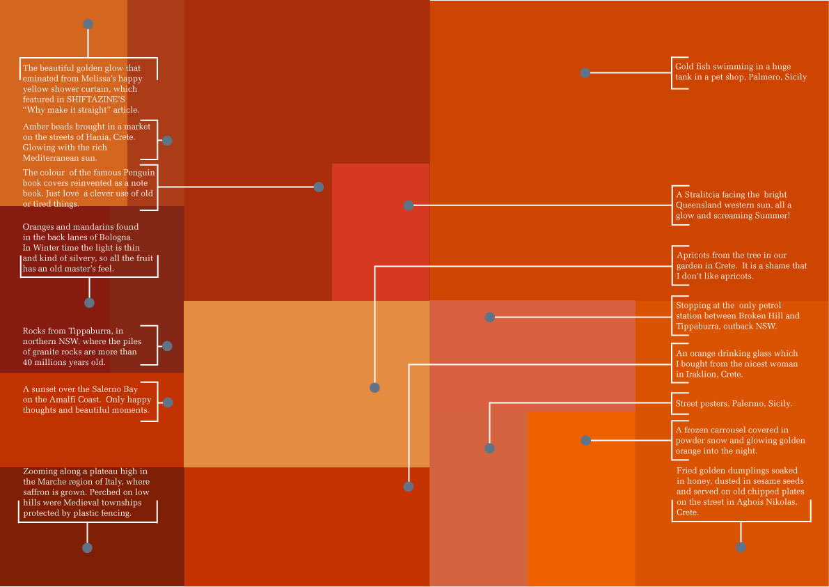
Orange
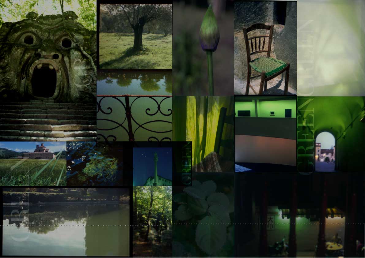
Green


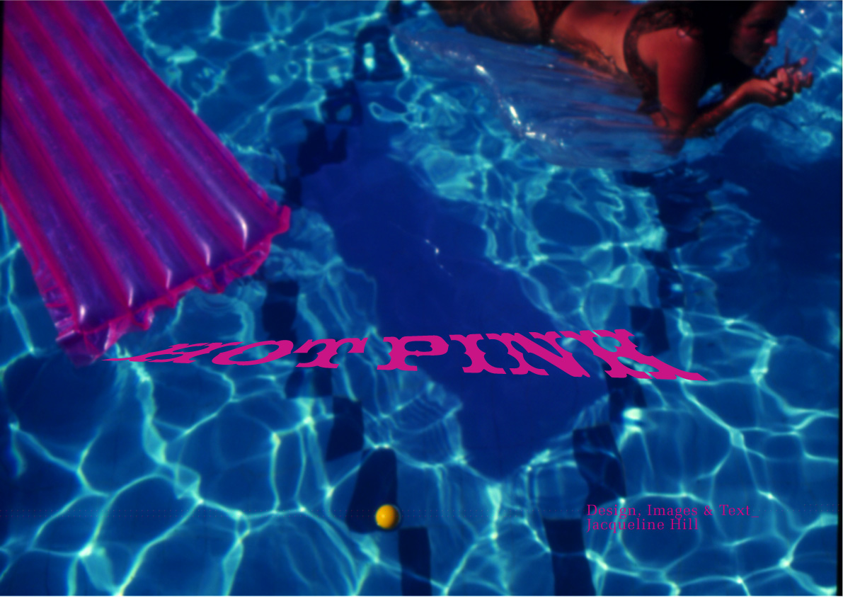
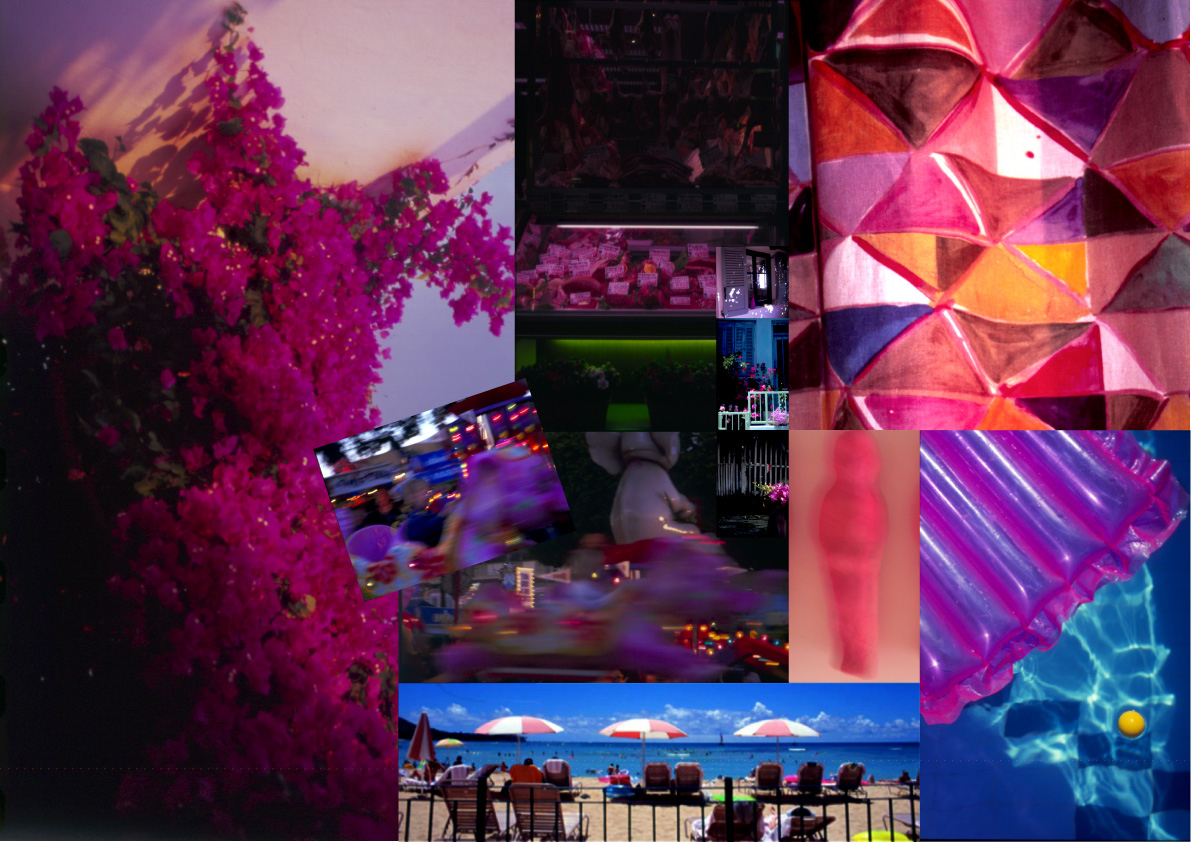
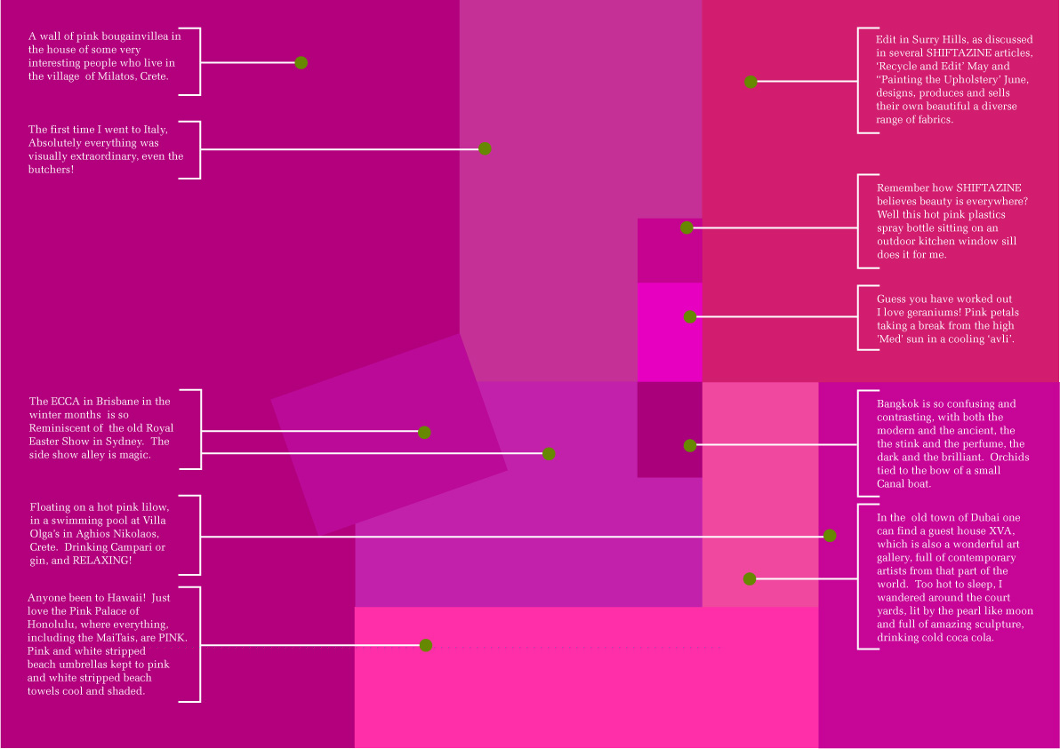
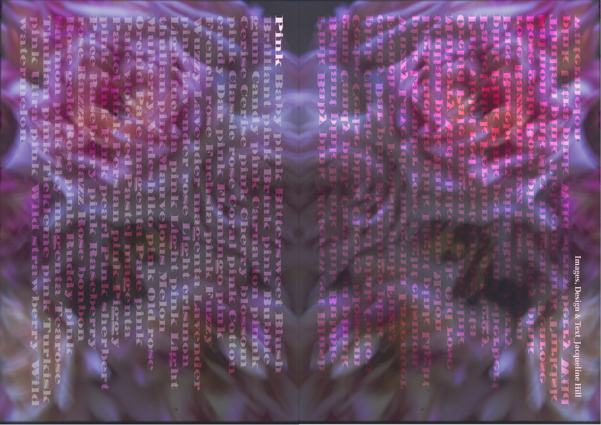
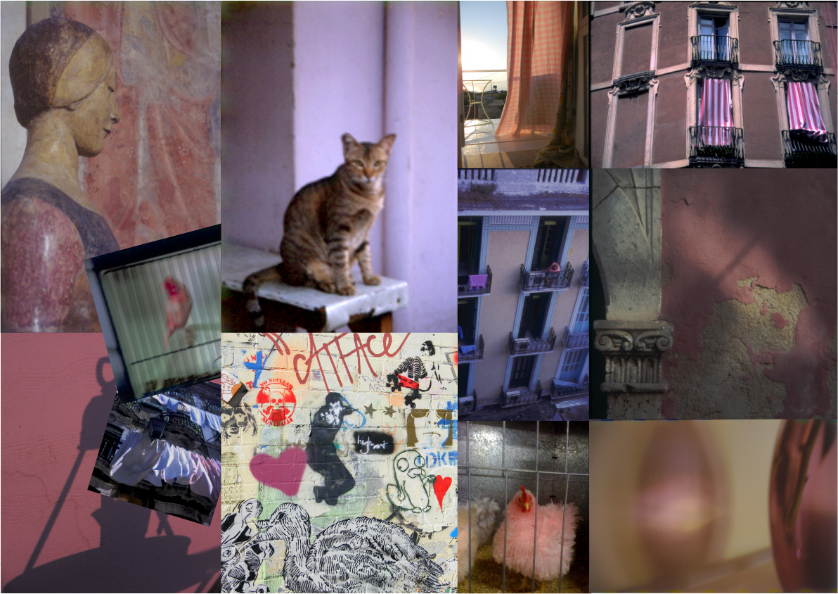
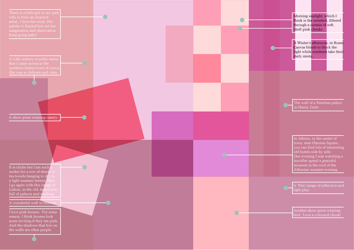
Pink
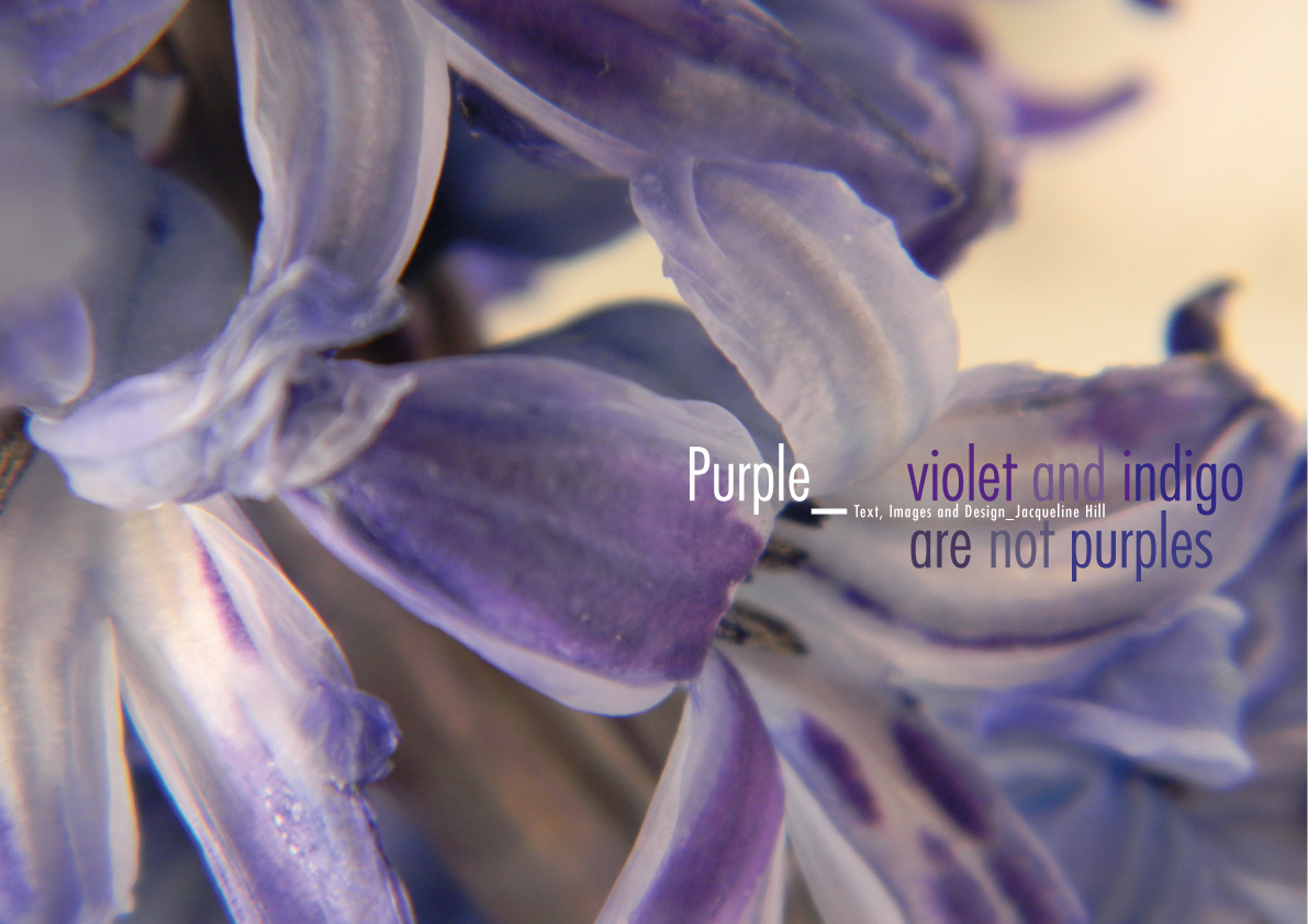
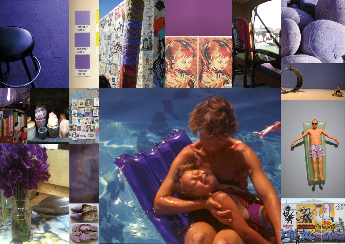
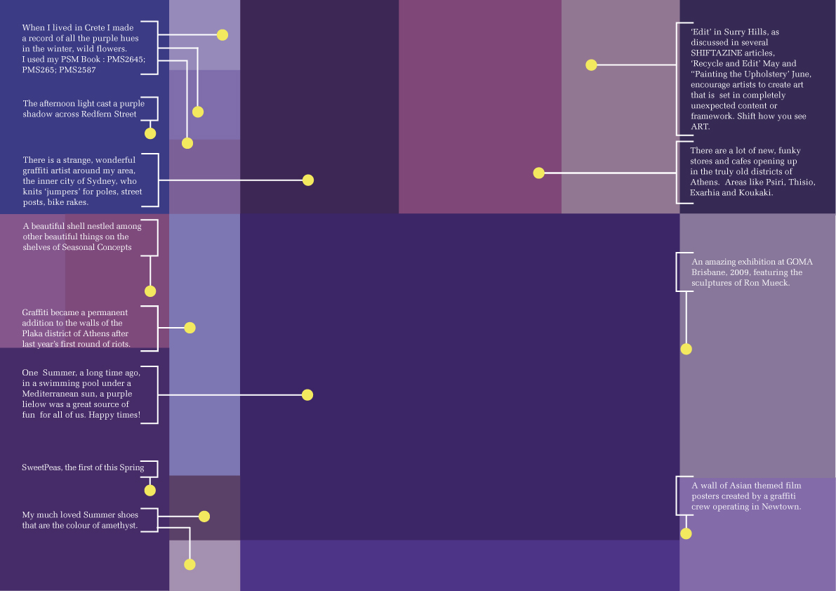
Purple
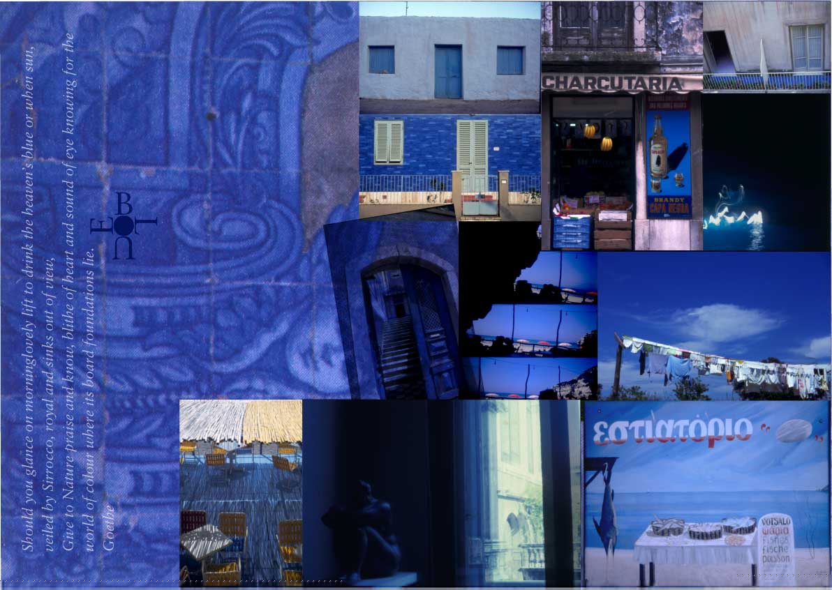
Blue


Magenta